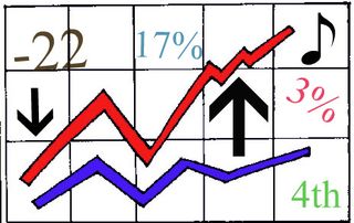
People really like numbers and the news media likes them too. I thought it would be fun to make this pretty chart with numbers for the housing market. I used a proprietary formula . . and that means I can't tell you how the numbers were made up or where they came from but they really are the numbers.
They show that home values have gone up and have gone down and they also show that one state is fourth in the country when it comes to the number of foreclosures. It could be your state but maybe not. Your state could be one of the 17% but I hope not. I put a note on my chart too.
The news media will have fun with these numbers. They will be on the evening news and there will be a story about what they mean. Stay tuned for some more data created from my proprietary source. I may use it to build a web site and start selling ads . . stay tuned.


A third party aggregate site said that my market (Austin) is the number one worst housing market… for people wanting to buy pink stucco homes. It’s a shame, huh?
Lani – thanks for sharing that. Information should be set free and consumers need to know. I will add pink houses to my proprietary system to protect consumers.
This information is just what I have been looking for! Thanks! Now I can blog about stuff and have something colorful and pretty to back it up or not.
P.S. I think I’ll send it to the media and really get attention.
KK – You just can’t beat a good graph. the actual numbers are kind of irrelevant